

A Project with Monica G & Family, Valley Village, CA
The challenge:
“We had just moved from a 2 bedroom to a 5 bedroom home. There was so much to do to make our new house look like a home. Not to mention that at that time we had a 1-year-old and another baby on the way that month! I was overwhelmed. Knowing that I would need a space in our home where both the kids and I could comfortably spend most of our days, I hired Tess to help me create and design this room. The biggest challenge was to find a balance between what the kids would want and what I’d need to feel comfortable. I also wanted the design to be fun and playful, but still feel cool enough for adults who can appreciate good design.”
Summary:
Create a space that is functional and inspiring that both kids and parents can enjoy.
The Process:
Moving is one of the most stressful things one can do. Moving with a one-year-old while seven months pregnant? Well, let's just say, I'm glad Monica reached out for a little bit of help. Monica's husband was really involved with a lot of the other spaces in the home, but gave the reigns to her for this special multi-functional room. I loved the idea of making a playroom that adults can enjoy too. It was a unique challenge, but when Monica mentioned she'd be open to a fun wallpaper, I knew this project was going to be a fun one.
As usual when it comes to choosing a design, we started with sharing our ideas via Pinterest.

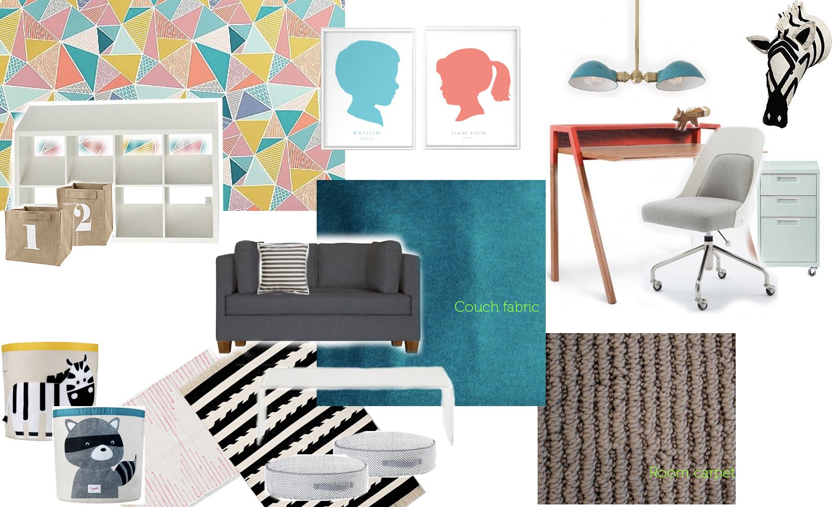
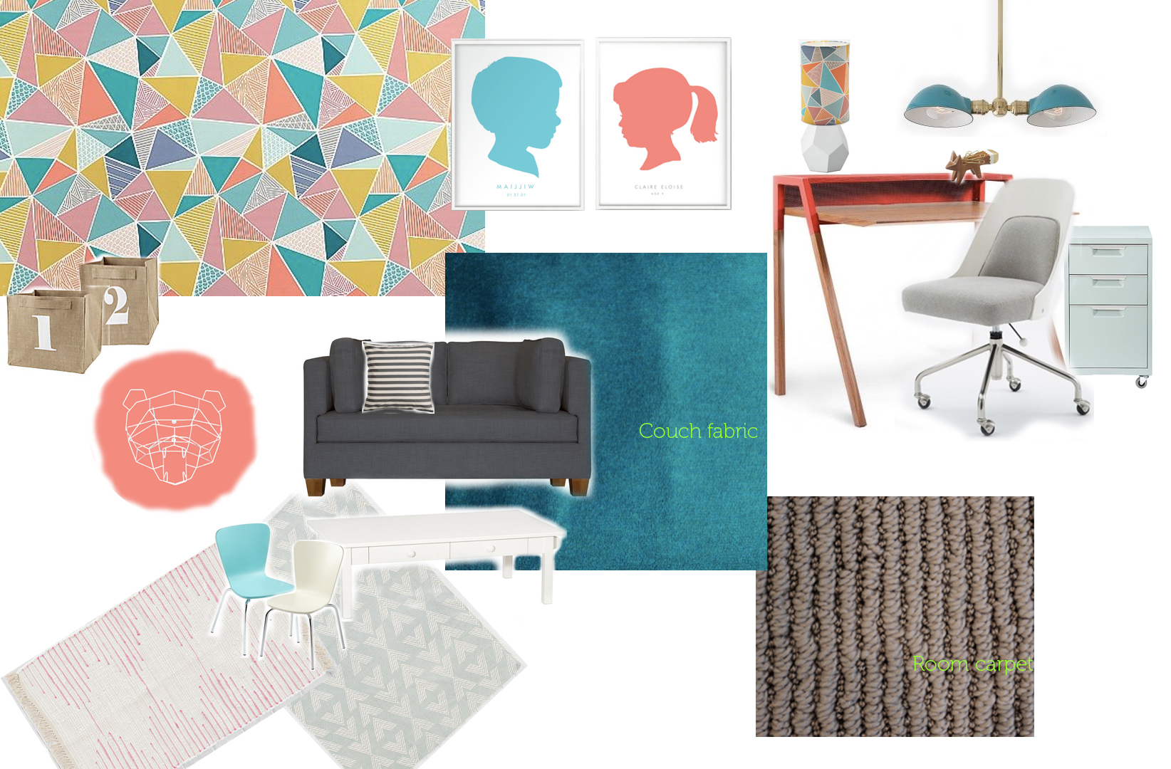
THE CONCEPT:
As you can see here, the ideas were bright, colorful, and modern. There were two ways I interpreted what I saw: primary colors and Scandinavian colors. So, the two concepts I presented were defined by that distinction.
While my personal tastes are always secondary to the client's tastes, in my heart of hearts I really wanted Monica to lean toward the second concept with the Scandinavian color palette. I love a good, bold color palette as shown in Concept #1, don't get me wrong. However, color palettes in Scandinavian Design can be very colorful and eclectic, but they also tend to have a milky shade and tint to them, which makes everything feel softer than using a more pure primary version of the same colors. As such, it's a great idea for playrooms and offices alike, because a colorful Scandinavian palette can bring a lot of energy to a space, without triggering any major color reactions (that many people might see as stressful) like a bright fire engine red.

Concept #1
Concept #2

image via http://www.sianelin.com/
And hooray! we ended up going in the direction of the second. Turns out that Monica loved the wallpaper (pictured left) which I was so thrilled to learn. Wallpaper can be a scary choice for a lot of people because it feels more permanent than paint and, yes, wallpaper is the more expensive choice (especially unique and pretty wallpapers). However, 1) Wallpaper today is MUCH easier to remove than wallpaper from twenty years ago as long as it's applied to a correctly primed wall, and 2) there are few things that add personality and statement to a room than a beautiful wallpaper. On just one wall (a more affordable way to incorporate it into a room), it automatically adds a level of sophistication to a room and up-levels all the design elements around it. Put an Ikea bookcase in front of a beautiful boutique-designed wallpaper, and suddenly the bookcase will look like it's from Design Within Reach instead.
Needless to say, I was very happy that Monica loved this wallpaper as much as I did. While I love incorporating black and white elements in any room design, Monica wanted things to feel a tad softer, so here's the final concept that was created:
The Result:
And now for the most exciting part of any project: when it finally comes to life.


As a reminder, here's a "Before" of the space: a green paint color from the previous owners, a dark black shade, and pretty much nothing else. After (above and to left) colorful, happy and functional.

This project also incorporated some fun DIY projects for me. One of the things Monica loved was this Wire Bear Head from Bend Goods. She wanted it in white, but the walls were white as well. I didn't want him to be visually lost in the space, so I recommended we paint a "trophy mount" for him so he popped. During the day of installation, I simply did a free-hand trace in pencil to make sure the outline was the right size for the bear, and then I took a paint color that I color matched to the coral red on the wallpaper. That way, Mr. Polar Bear had a place to be seen next to the window, and became a fun statement piece in the room apart from the wallpaper:

Monica also wanted a 'gallery wall' to hang her kid's artwork on when they made it. To give a space to do that without wrecking any walls, we came up with a mixture of cork boards and clip boards to hold artwork as it collects. The blue cork boards were found at the Container Store, but we couldn't find clip boards that we liked, so I DIY'ed the remaining cork boards and clip boards with gold paint, to add just a little more visual interest while the kids art will collect over time. Mixing that in with existing artwork (the one in the middle with blue and red is her daughter's very first painting!) we created a gallery wall that has a completed feel, even though the real art was yet to come.

All in all, it was an extremely fun project and I loved the result. Monica has since told me that they spend the bulk of their time enjoying this room in their new home, and at the end of the day that's what makes me feel the best about my work. Here are a few more things Monica had to say:
“Tess was able to quickly source some great [items] and show me mood board options integrating those items so I could better visualize the end result. This alone saved me so much time and removed all the guesswork of wondering how it would all fit together. She found some great pieces from new vendors that I would have never found on my own. She also worked directly with the vendors to ensure I ordered the right sizes and the right quantities of wall paper to cover the whole wall. She’s so organized and thorough in her design process that it made it fast for me to make decisions. Once everything was delivered, she even came over to help build and set everything up.
I’m ecstatic with the results. It’s the most practical and functional room in the house, yet it’s still fun and surprising in it’s design elements. We use this room more than any other room in the house and even when we have a house party, guests tend to migrate to that room as it’s so warm and inviting.”
Thanks to Monica for offering her feedback and for such a fun and rewarding project; this was one of my favorites to date.
If you have any questions about what you see, or if your own living space needs some finishing touches, get in touch.